Color, Mind, and Planet: The Psychology of Sustainable Hues
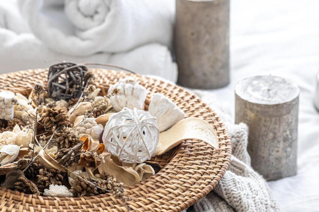
Nature-aligned greens, bark browns, and stone grays can reduce stress and encourage gentle focus. Research suggests biophilic references lower heart rate and improve mood. Echo local landscapes to feel grounded rather than themed. Share a photo of a natural scene that inspires your palette and tell us what feelings it anchors.
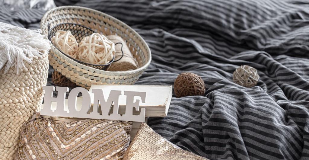
Color, Mind, and Planet: The Psychology of Sustainable Hues
Colors with higher light reflectance values bounce daylight deeper indoors, easing reliance on artificial lighting. Try warm off-whites, pale clays, or sandy neutrals to lift shadows without dazzling glare. Pair with thoughtful daylighting and dimmable, efficient fixtures. Which bright-but-soft hue has helped you use fewer lights at home?